E-Commerce Platform:
Time Slot Redesign
Challenge: Improve the grocery app’s time slot reservation flow for delivery and pickup.
Deliverables: Competitive & Visual analysis, user surveys & interviews, personas, task flows, journey maps, wireframes, prototypes, usability tests.
Role: Product Designer. Led research, usability testing, and UX design for the app’s storefront flow.
Collaborated with PMs, engineers, and a Senior UX Architect.

The Challenge
Shoppers found it difficult to navigate the time slot reservation flow. Many couldn’t tell which slots were available, missed key actions, or felt uncertain if their selection was confirmed. On mobile, the experience felt cluttered and unintuitive, leaving users frustrated and unsure if their order was secure. These pain points disrupted their shopping journey and reduced confidence in completing a purchase.
The Solution
To improve the experience, I focused on giving shoppers clarity, control, and reassurance throughout the time slot flow: Make availability scannable → Time slots are easy to read at a glance, with clear distinction between available and unavailable options.Provide instant feedback → Visual confirmation when a slot is selected or changed removes uncertainty. Enable flexibility → Shoppers can modify mode, store, or address directly within checkout without starting over. Design mobile-first → Simplified layouts and interactions address the biggest source of friction.Add proactive communication → Notifications and dynamic indicators (e.g., expiring slots) keep shoppers informed and in control.
Impact

Shoppers could easily see available time slots and understand the next step.

The streamlined flow reduced friction and saved users valuable time.

Clear confirmations gave shoppers trust that their order was secure.

Quick Links

Wynshop is a leading provider of digital commerce solutions for local grocery retailers, expanding rapidly across North America, Australia, and Europe.
In the fast-paced grocery e-commerce space, one critical challenge is enabling shoppers to easily schedule delivery or pickup time slots. The existing flow was confusing and hard to navigate, leading to frustration and drop-offs.
This case study focuses on my redesign of the time slot reservation experience, aiming to make it faster, more intuitive, and mobile-friendly.
This case study focuses on my redesign of the time slot reservation experience in the mobile app, since I was directly responsible for the app flow. While I also did research & design for the storefront, the detailed scope here will follow only the app journey.
*Note: For this case study, I applied a different design system while preserving the core flow and research. I also explored additional features that were proposed but not implemented at the time. The focus here is on the app flow.

Research Process
In the research phase, I conducted a competitive and visual analysis, ran surveys and interviews with shoppers, and synthesized insights into a persona and journey map. This approach helped me capture both the functional challenges and the emotional drivers behind how people book their grocery delivery or pickup slots.
Competitive & Visual Analysis
I conducted competitive and visual analyses, then reviewed them with the UX team and project managers, which led us to run targeted tests on time slot screens and flows. I also tracked user behavior via Microsoft Clarity and compared it with qualitative and quantitative findings.
While my full study included over 30 e-commerce sites, for this case study I focus on key retailers in the US and Europe.

Competitive Analysis - Time slot section (2021)
Research Plan & Interviews
I conducted a comparative usability test between our client’s platform and 3 direct competitors, building the scenario from prior observations and external case studies.
Scenario:
“You want to order groceries for the week. Select a time slot for pickup and/or delivery, add items to your cart, modify the time slot, and return later to complete the checkout.”
More than 30 testers participated across three devices. The first noticeable finding was that shoppers spent significantly more time on our platform than on competitor sites. Many struggled to select the right day, identify available slots, or receive clear confirmation after booking. Overall, participants described the screens as unintuitive and time-consuming.
Research Questions:
How is your overall experience?
How difficult was navigating through time slots and finding the right time?
What aspects of the experience can be improved?
How was the checkout process? Was it clear?
What happens if you return after 30 minutes and attempt to modify or rebook?

Statistic HotJar, Microsoft Clarity, Surveys
“I should be able to easily identify the available time slots the upcoming days, but I had to scroll down and it was to crowded to notice the available one.”
— Marcus, UK
“I should be able to see the available and unavailable slots, selected ones and unselected ones. I went back and forth since wasn’t sure if I even select one.”
— Alex, US
“I never got confirmation that I selected the time slot. I had to go back and forth and found it on the homepage. This process should be fast and effective, but this one is not.”
— Maria, US
“To many things going on there! When I selected the time slot, I didn’t even noticed the button changed color. Not very intuitive. What I like is the option to change it on homepage.”
— John, US

Current Design
When observing the current time slot. I made notes on where our testers struggle to continue.
The overall experience was underperforming compared to the other two competitors.
Here are some takeaways
Shoppers found the shopping mode section “crowded” and “messy”. Also, the BACK arrow was missing from the page.
Shoppers were clicking on the “Choose the pickup time” section, but the section didn’t work.
No indicators about the dates and carousel view
Too much text and information. Some testers could not find the available time slots.
Buttons at the bottom were confusing?!
Personas & Journey Maps
Mapped pain points across checkout flow. Clear insight: one problematic screen slowed down the entire journey. Personas highlighted three shopper archetypes with different scheduling needs.


Personas

Research & Key Insights
Top Pain Points (consolidated):
Navigation & Visibility – Date carousel often hid the selected day; users clicked inactive dates or missed it.
Clutter & Confusion – Time slot list felt crowded; available vs. reserved slots were hard to distinguish.
Lack of Confirmation – Selecting a slot didn’t feel “final.” No clear feedback, no duration for reservation.
Mobile-first Weaknesses – Mobile app users reported worst experience: “messy,” “not intuitive,” and slow.
Additional Observations:
Our time-slot page showed all slots, even booked ones, making the list overly long and overwhelming.
Shoppers missed a back button and note for delivery person option (which competitors had).
Flow jumped directly from time-slot selection → checkout, skipping opportunities for deals/offers.
Key Insights:
Users need clarity, feedback, and trust when reserving a slot.
The platform has an opportunity to deliver peace of mind and customer service digitally.
A fresh, approachable design is required, especially on mobile.
New feature integrations (notifications, modification options, “forgot something,” notes) are necessary.

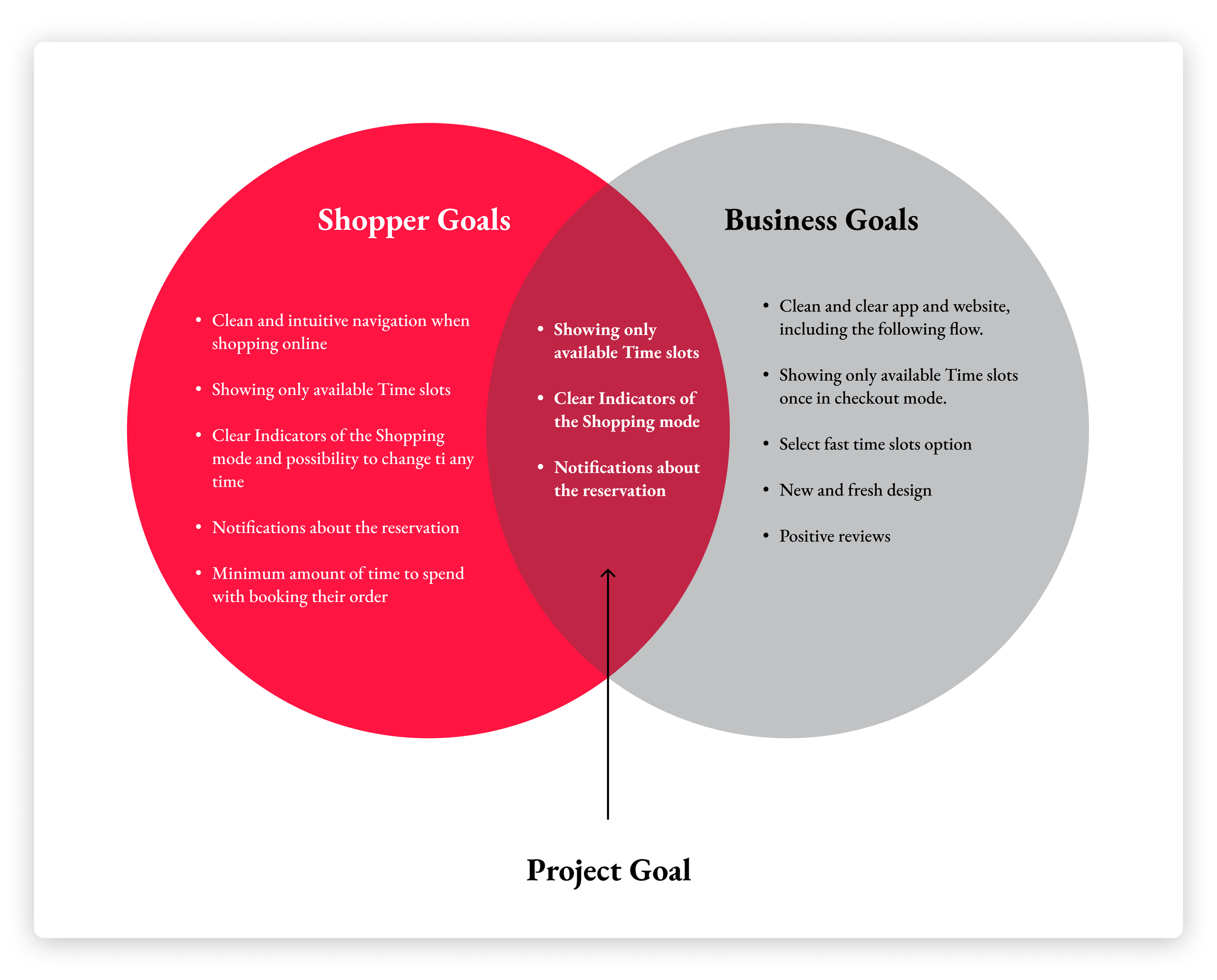
Project Goals
Project Goals (from synthesis):
Align shopper needs (clarity, speed, control) with business needs (efficiency, positive reviews, fresh design).
Keep existing flat site structure while enhancing clarity, feedback, and flexibility.
Deliver not only functional booking but a trustworthy, reassuring experience.
Ideal Experiences
Knowing who I was designing for allowed me to ask myself how the experience fits into the shopper experience.
Combining our research and brainstorming the different things people do before, during, and after shopping for groceries allowed me to come up with a broad set of tasks quickly.
I categorized and segmented the tasks into behavioral affinities and aligned content and features.
It gave me an opportunity to:
Visualize what existing functionality and content
What needed supporting
What opportunities were available to innovate, and also
What could be discarded from the existing design.

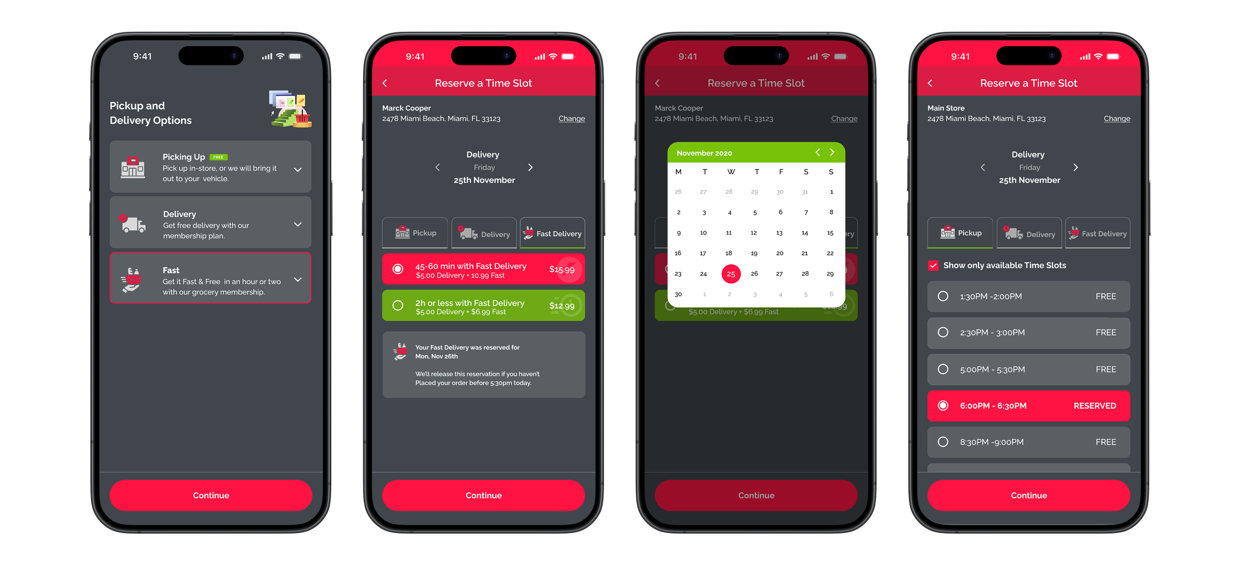
User Flow (Mobile-first)
Below is the simplified shopper journey for booking a slot:
Select Shopping Mode (Delivery / Pick-up)
Choose Time Slot → immediate confirmation state
Forgot Something Flow → continue browsing; after 30 min, show reminder “Your reserved time slot is about to expire”
Enter Contact Info + Instructions (note for personal shopper / delivery)
Proceed to Payment
Review & Confirm → Pay
Success Screen → confirmation number + status “Paid & Reserved”

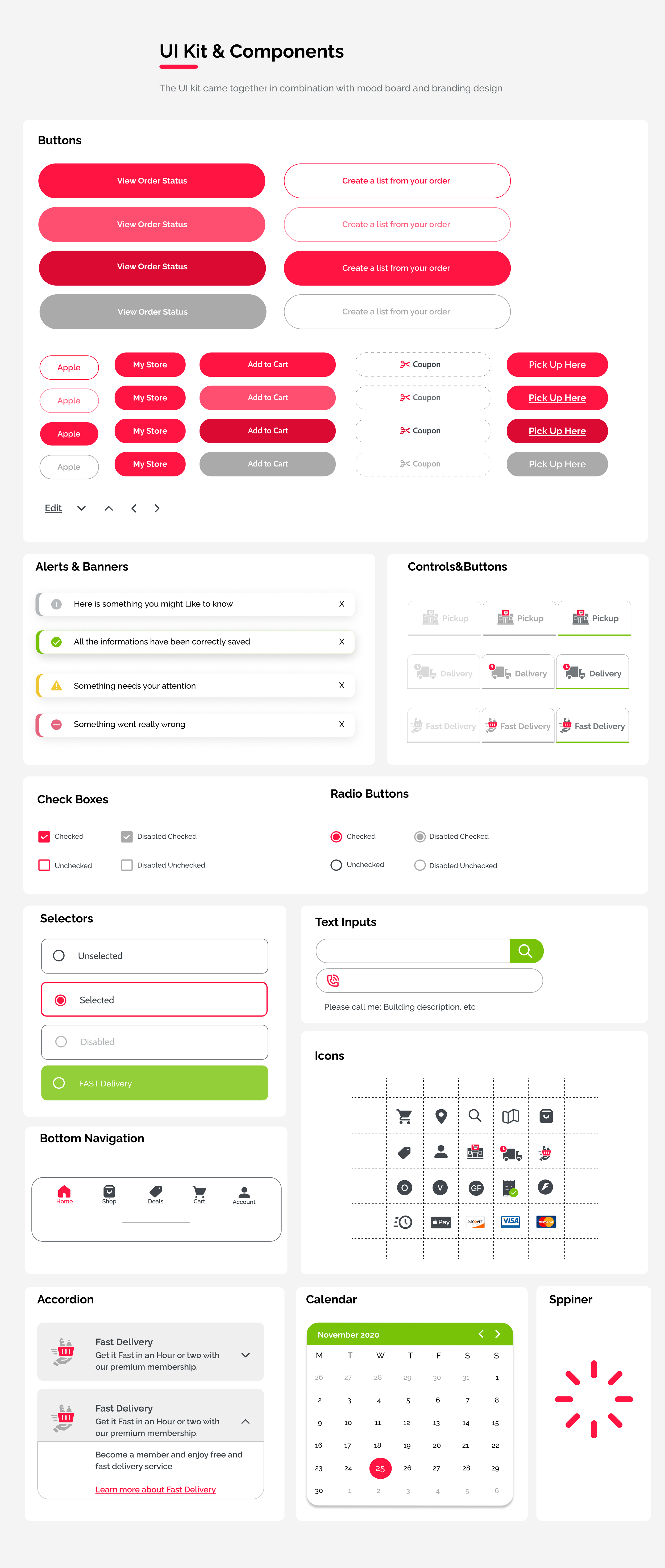
Mood Board & Ui Kit
Inspired by freshness, clarity, and simplicity.
Palette of fresh greens and pinks to evoke produce and vitality.
Chose Raleway typeface for readability and modern, approachable feel.


User Testing
Now the prototype needs to be tested! It was done with the Devs’ assistance, and the results were positive and informative, which led to some revisions and adjustments.
Interview Style: Interviews conducted via Google Meet and Zoom.
Participants
Participant 01: 28 years old Manager in Hotel, USA
Participant 02: 33 years old, Veterinarian, USA
Participant 03: 46 years old, Sales Consultant, USA
Participant 04: 65-years-old, Manager, Europe
Participant 05: 70-years-old, retired professor, Europe
The team created more than 20 questions. But for privacy reasons, I will focus on the overall experience (UX) and difficulty during the process.
Question 01: Please rate the level of ease or difficulty going through the action of booking the time slot. From the moment of choosing the shopping mode to the end!


Question 02: Please rate the overall experience. Designs, UI, Difficulty booking the time slot, change address, shopping mode, etc.
Testing Insights
Customer service helps the user feel more confident in their purchase of insurance.
Shoppers feel more confident when they start the checkout process
The designs help them navigate more easily and confidently
The possibility to change shopping mode, address, and payments during the process was important to all shoppers
Shoppers said that new designs are clean and simple.
Shoppers appreciated the info notes regarding their actions.
Younger shoppers liked dark mode better
Revision on 3 Screens
Revision was implemented on 3 screens. The Address selection was the one that didn’t have a specific indication about the default address. The same rule was applied to the store selection.


Revision 01:Shoppers didn’t know what the selected address was. The radio buttons are added as the indicator.

Revision 02: Same pattern - shop selection. The main store is selected, and the radio button is turned on.
Revision 03: Modifying order. Note will be appearing during the entire modification process.
FINAL
PROTOTYPE
Get it Right On time!

Disclamer:
1. All data and insights presented in this case study are based on publicly accessible information and do not represent the confidential data or official views of the company I worked for.
2. For the purpose of this presentation, I significantly modified the UI kit and visuals while preserving the original user flow and functionality to better illustrate my design process and decision-making.