Redesigning Filter Logic & Product Discovery for a Grocery E-Commerce Platform
Challenge: Develop a new filtering and product listing system for an e-commerce platform.
Deliverables: Competitive analysis. User surveys and interviews. Testing Report. Personas. Task flows.
UI Library. Prototype. Usability tests.
Team: Product Manager, Product Owner, Senior Product Designer, 5 Developers.
Duration: 6 Months
Challenge
Wynshop’s filtering system was poorly structured and lacked collaboration across teams, resulting in unintuitive user flows that frustrated shoppers and hurt conversion.
Instead of guiding users to relevant products, the filters created friction—driving visitors away and missing key sales opportunities.
The Solution
I conducted a full UX audit, competitive analysis, and user interviews to uncover behavioral patterns and pain points. Based on these insights, we redefined filtering logic, reorganized categories, and designed a more intuitive, personalized experience.
The new system helps users find exactly what they need—boosting engagement and conversion. Later, I partnered with product owners, managers, and developers to align implementation and ensure cross-functional success.

Impact

Users immediately understood how to filter, browse, and locate products.
Improved information hierarchy reduced time-to-find by 40% in
usability testing.
Refined logic, multi-select, and sub-filter options enabled faster and more accurate product discovery. Users described the experience as “more personalized” and “less frustrating.”

By removing friction in the search and filtering process, the new system significantly boosted product interactions and noticeably improved checkout completion rates.
Quick Links

Background
Every day, online shoppers leave without buying because they can’t find what they need — a challenge that spans all of e-commerce. Continuous testing on our grocery platform revealed a critical issue: users rarely used filters to search for products.
Usability tests and behavioral analytics confirmed that the problem wasn’t just visual — the filtering system lacked clarity, consistency, and smooth interaction patterns.
Our platform, a pioneer cloud-based solution for grocery retailers, was built by retail experts and developers to fill a long-standing technology gap in the grocery industry.
Our mission: empower retailers with intuitive, data-driven tools that enhance product discovery and unlock their full e-commerce potential.
My Role
As the lead UX/Product Designer on this initiative, I owned the end-to-end design process—from framing the problem space to delivering validated solutions. I collaborated closely with a PM, PO, senior designer, and five developers, aligning user needs with business goals in a fast-paced e-commerce environment.
Key Decisions & Contributions
Problem Framing: Identified friction in product discovery through user interviews and analytics, reframing the challenge around cognitive load and filtering fatigue.
Research Strategy: Designed and executed a mixed-methods research plan (competitive audit, surveys, interviews), synthesizing insights into actionable personas and task flows.
Information Architecture: Led the redesign of filtering logic and product categorization, balancing user mental models with backend constraints.
Prioritization: Facilitated MoSCoW workshops with stakeholders to align on MVP scope, ensuring feasibility without compromising usability.
Prototyping & Testing: Created low- to mid-fidelity prototypes and conducted usability tests across two rounds, iterating based on user feedback and behavioral patterns.
Design System Contribution: Expanded the UI library with reusable components tailored to the platform’s visual language and accessibility standards.
Impact: While specific metrics remain confidential, post-launch feedback and platform ratings improved significantly—from 3.1 to 4.8 stars—reflecting enhanced user satisfaction and discoverability.

Research
Online grocery shopping is booming in the U.S., with revenue expected to surpass $422B by 2028 and over 138M active shoppers.
With clients across the United States, Canada, and Europe, our UX team continuously researches and interviews users to better understand their needs.
As the team’s UX researcher, I tracked market trends and collaborated with project managers and clients to identify key pain points.
Using tools like HotJar, Microsoft Clarity, Google Analytics, and TrymyUI, I analyzed behavior, reviews, and data to prioritize issues.
One major insight: 10% of users reported poor filtering.
While we couldn’t fix missing inventory, we focused on solving UX problems that directly impact product discovery and conversion.
Read Secondary Research…

Hotjar data revealed minimal engagement with the filter panel — users preferred typing or scrolling.
Competitive Analysis
The process continued with a competitive and visual analysis of over 50 major grocery and general merchandise e-commerce platforms across the US and EU. The goal: spot opportunities where our platform could stand out and deliver a superior user experience.
Being an investigator is a must — understanding competitors’ strengths is useful, but uncovering their weaknesses reveals the real market gaps. That’s where innovation — and our client’s goals — align.
A competitive audit of 50+ e-commerce platforms revealed that most grocery sites overload users with nested filters and unclear labels. Few allowed multiple selections or personalized logic. These findings guided our design opportunities
Check PDF decks
Interviews & Test Flow
Using all the tools, I was able to organize and focus on the shopper pain points, making a clear distinction of what we as a UX team can do to improve the CX and UX, and what is something we can not help with!
Tests were run on TryMata software for Desktop, Mobile, and the App:
Total: 32 testers
From Canada&US
Special request: Testers MUST have an account with the retailers in the test.
Tests were run for Desktop, Mobile Android, and iOS

Test: Filtering - Example Old Design
“Using the filters/deals/categories to search for foods is not ideal. It would be much more efficient using the search tool.”
— Shopper 1, Desktop
“I would love broader filters and then sub filters. I'd also like an easy way to load and shop those offers all without being redirected to a new page.”
— User 4, App
“Very frustrating when you want to browse ONLY the category. Because putting the brand in the search bar will add other brands like it too. very annoying.”
—User 5, Desktop
“The screen freezes when i selected filter and take me back to product all products? I think this filtering needs to be better organized and improved! I am looking for the items on sale and I don’t have that option”
— Shopper 10, Mobile
“Why am I looking categories in filters section? After every selection I am back on product page?This is bad and makes me anxious.”
—User 9, Mobile
“Filtering options are just poor and have no point, I have allergies and I need to search the products based on that and other specifics.”
— Shopper 7, Mobile
“Difficulties we're with the filters of search as I could not find some items I needed because it is to messy to even start searching, I would rather use the search bar for products.”
— Shopper 5, App
“The filters are frustrating to use as you can only choose one at a time. Prefer the search bar as filters often show way too many products.”
— User 2, Desktop


Personas
Persona & Journey Map
I adapted the persona and implemented all the findings from interviews and quantitative data. Journey Map helped me visualize an individual relationship with a product, online grocery shopping, and searching for specific products.

Shopper Journey
Research Key Findings
In the next stage, I had to organize the collected data in groups based on their natural relationship. From there, I was able to identify user pain points, what they are seeking, and what they are interested in.


Understanding Filter Patterns
Filters help users narrow down large product lists to relevant options. Good design should guide users quickly from default to refined results—removing friction along the way.
From research and testing, here’s what we learned:
Grocery filters are numerous and must work across devices.
They vary by type: price, brand, rating, dietary needs, etc.
Filters have states—selected, unselected, disabled—and should remember user input.
Validation can be tricky, especially with complex queries.
Clear error messages and smart defaults are essential.
Keep filters simple. Design from the shopper’s perspective—whether they’re searching by flavor, preference, price, or deal. Use the language your customers use.
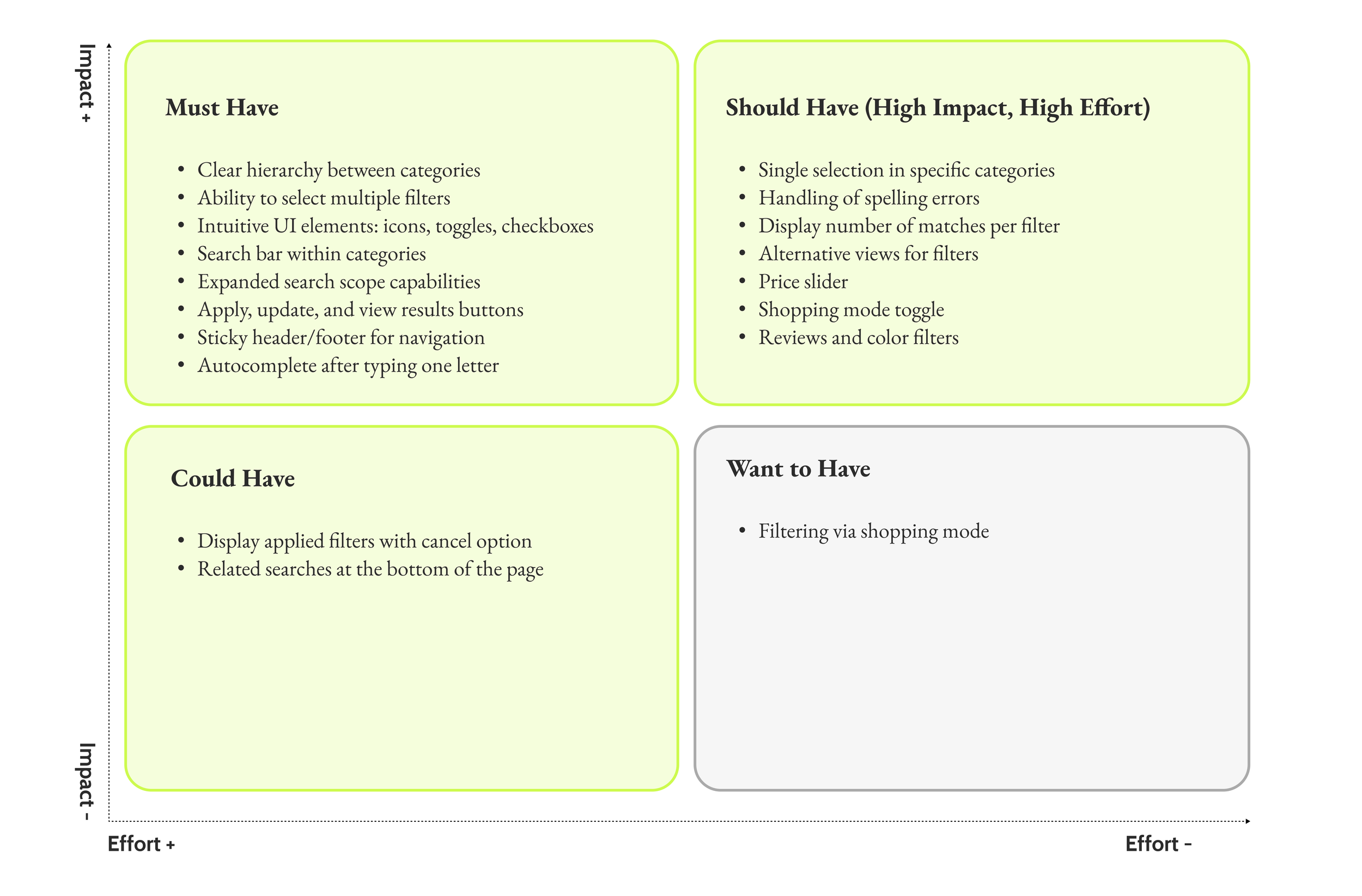
MoSCoW

Deck for Devs

Additional Filtering Concepts (Exploratory Work)
These concepts were part of my extended design exploration and were not implemented in the original project, but they demonstrate how filtering could further enhance usability and personalization.
Sliders
Sliders are ideal for quick exploration across wide ranges, but they can frustrate users who need precision.
My design combined a slider with a text input field, allowing users to enter exact values directly without relying solely on the slider.
Ratings
Research and usability testing consistently highlight the importance of ratings and reviews in purchasing decisions. While more common in general merchandise (GM) than in grocery, I proposed including a rating filter to help users make confident, informed choices.
Colors
In categories such as home goods, hardware, or apparel, color significantly influences selection. I suggested adding color swatches alongside color names to make filtering more visual and intuitive.
Shopping Mode
Some users prefer Pick-Up options and want to filter products based on local store availability. Introducing a shopping mode filter could streamline their planning and improve the shopping experience.

UI Kit & Logo + Branding
Since Wynshop’s platform is implemented across various e-grocery retailers, we often needed to adapt designs to align with each retailer’s brand identity.
For the purpose of this case study, I chose to act as the retailer myself—recreating the entire branding system, including a new logo.
This allowed me to present the solution in a way that both complemented the grocery industry and reinforced the brand values our platform aims to support.
This logo is inspired by my interviews with both shoppers and clients. I wanted to make it simple and clean. Starting with black and white and later implementing some colors.
UI Kit Links

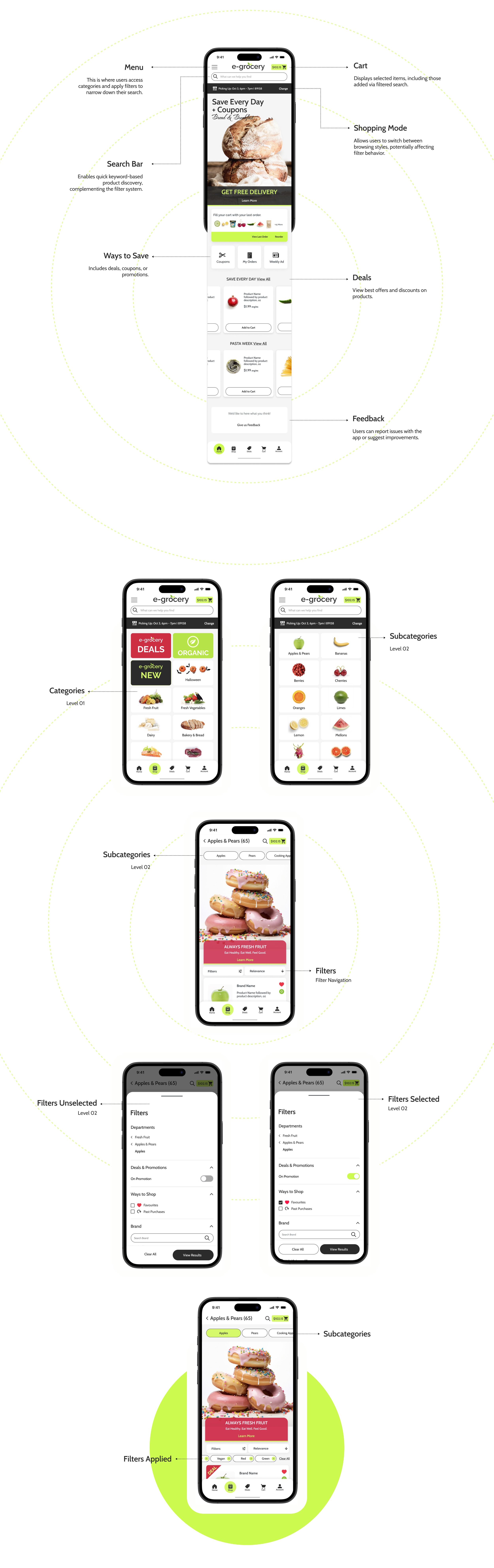
HI-FI Wireframes
Below are the homepages for the desktop, tablet, and mobile versions.
My first full version of the prototype was intentionally built out for mobile devices, following the mobile-first approach.
This flow is the same as we asked our Shoppers to do - Look For the Apples using filters.
Mobile First Approach
-
![]()
Homepage
-
![]()
Categories
-
![]()
Level 1
-
![]()
Level 1 - Pills
-
![]()
Level 2
-
![]()
Level 1 - In Filters
-
![]()
New List Item
-
![]()
Filters Checked
-
![]()
Filters Applied


Tablet Screens - Categories & Search Bar


Homepage - Tablet
Categories
Desktop Screens

Homepage
The App
While designing and improving the new app, the UX team discussed about incorporating photos in category and subcategory sections.
The Flow and designs are in the “UX Vault”. This is just a proposed example.
App Designs
Final Prototype - Videos

Key Metrics
To ensure consistency and smooth collaboration, I created a handoff guide for developers and future designers.
The redesigned filters were launched as an A/B test, tracking both commercial metrics and customer satisfaction. The results showed a positive lift in engagement and conversion, confirming the new system’s impact on usability and overall experience.
To see how the filters please check: Dunnes.com, Shoprite.com, Foodland.com, Saveonfood.com, etc., or download the apps.
Usability Test
The usability test was conducted remotely, one-on-one, using TryMyUI software across mobile, desktop, and tablet platforms. Over 50 users participated, allowing us to observe authentic behavior and gather actionable insights. While the feedback led to a few minor design adjustments, the overall response was overwhelmingly positive—validating both the concept and user experience of the app.
Test Flow Overview
Log In Users access the platform and log in with their existing retailer account.
Product Selection Users search for specific products (e.g. organic, vegan, branded) and add up to 5 items to their basket.
Checkout - Users review their cart, consider substitutions, and proceed to checkout.
Tests ends before the payment.
Filtering Improvements Introduced
Multiple filter selection within the same category
Sticky header and footer for easier navigation
Search bar inside filter categories with autocomplete
Icons and toggle buttons for quick visual recognition
Horizontal display of applied filters
Price slider and radio buttons for refined control
Sorting options: Relevance & A–Z
Carousel view for categories and applied filters
Auto-refresh and partial search results
“Show All / Show Less” toggle for long lists
Feedback
“I loved how easy it was to filter by dietary preference—finally found my vegan snacks without scrolling endlessly.”
— Shopper 01, App
“I loved how easy it was to filter by dietary preference—finally found my vegan snacks without scrolling endlessly.”
— Shopper 02, Desktop
“I loved how easy it was to filter by dietary preference—finally found my vegan snacks without scrolling endlessly.”
— Shopper 03, App
“The icons helped me spot promotions and nutrition info instantly! It is finally super intuitive.”
— Shopper 04, Desktop
“Being able to select multiple filters at once was a game-changer. I actually found what I needed.”
— Shopper 05, Mobile
“The interface felt intuitive and smooth—I didn’t need instructions to find what I was looking for.”
— Shopper 06, Mobile

Disclamer:
1. All data and insights presented in this case study are based on publicly accessible information and do not represent the confidential data or official views of the company I worked for.
2. For the purpose of this presentation, I significantly modified the UI kit and visuals while preserving the original user flow and functionality to better illustrate my design process and decision-making.